


Happy Saturday…
It is Sentiment Saturday time. I’m super excited to share projects featuring the Unity Stamp Company monthly sentiment kits twice a month. I’m excited about today’s kit. It is full of lovely sentiments that shine against a beautiful background.
Featured Stamp Kit

Going back in time a bit with Basically Said. This simple beauty was the June 2014 sentiment kit. I love the swirly font in an elegant style and so full of a variety of sentiments. Perfect for a thank you, thinking of you and celebration card. The frames are designed to hold the larger script sentiments and then you can add a smaller sentiment to the front of the card or to the inside. Yep, I said inside. I really wanted the sentiments to work either way. I just adore the look of the single line sentiments on the inside of the card. Just pure and simple.
The Video
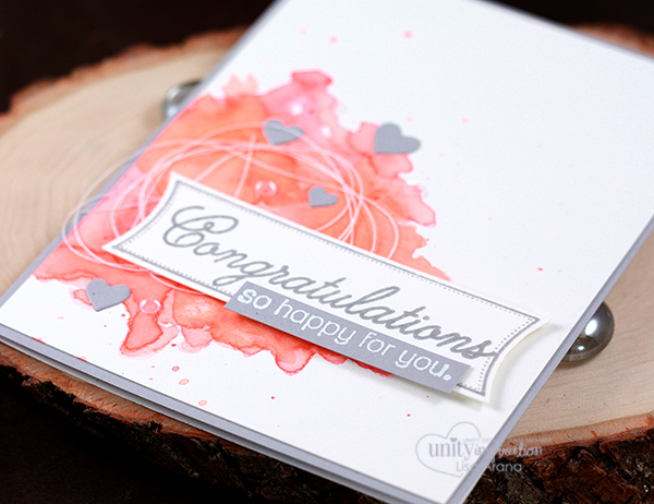
The Card
The Details
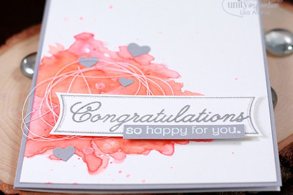
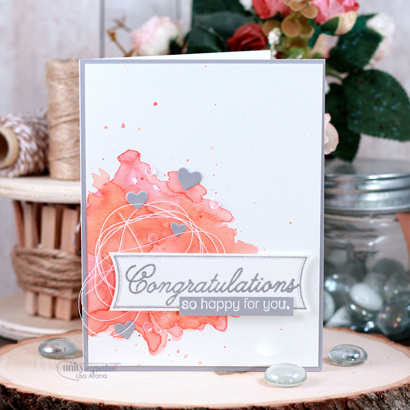
Bam. Thought I’d hit you with a pop of color this week. Nothing like a bit of watercoloring to add the most beautiful bit of color to a background. I love this idea for a wedding card. You can easily customize it to match the couple’s wedding colors and still keep it clean and elegant.

Let’s start with how easy it is to create that background. I used 3 shades of Distress Inks in Ripe Persimmon, Abandoned Coral and Worn Lipstick. I smooshed each one onto a clear acrylic block for my palette (you can use any slippery surface – like a craft mat or laminated sheet of paper – whatever you have). Next, I used a regular paint brush and brushed on clear water. This saturates the paper with water and starts the process to allow the ink to move. Starting with the lightest color, I alternated paint and water until I layered up all three colors. Once I liked the way it looked, I used my heat tool to dry it (I’m impatient). It seemed to need another layer of color, so I added a bit more of the Ripe Persimmon. Then, I let that dry completely before glueing it to my card base.
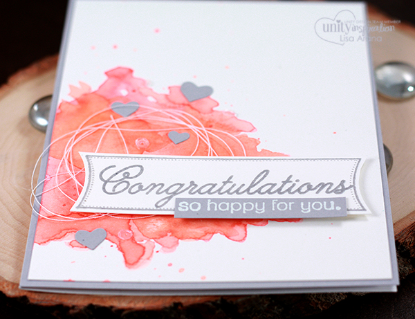 I couldn’t wait to add “all the little things” to this card. I started with the sentiment. Since, I had such a pop of color for the background, I wanted everything else to be grey and white. I stamped the sentiment and frame in grey on watercolor paper (I wanted the sentiment paper to match the background), then re-stamped it with Versamark ink so I could emboss it with clear embossing powder. Don’t you just love the shine and texture heat embossing adds. For the small sentiment, I embossed it in white on the same grey cardstock as the card base. I popped those up over some white thread. It keeps that thread in place without having to use glue. Last, I added some grey hearts and clear sequins for another bit of sweetness and shine.
Thanks for joining me today. I hope you are inspired by today’s watercolor background project. If you create something, I’d love to see. Join us in the Unity Show & Tell Facebook group to share your card and tag me.

Supplies
{Affiliate Links may be used when available at no additional cost to you}


