Happy Saturday! 🙂 I am so excited to up on the blog today and feeling SO inspired. I just got back from a vacation with my husband to sunny Playa Del Carmen, Mexico! There were so many pretty florals that had me feeling crafty!
Also– its a sure sign you’re a crafter when you look at a sunset and try to think about which Distress Ink colors you have that could be blended out to look like the stunning sky. hahaha. Anywho– back to the point of this post. I was feeling inspired by all of the flowers in Mexico– like these:
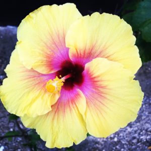
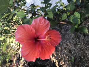
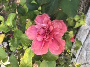
These totally reminded me of one of my very favorite kits… Donna Peony.
{Disclaimer} at the time of this post we had about 25 of these kits left. It is limited edition- once it’s gone- it’s gone for good– BUT– this is merely a concept and can be recreated with any large floral. Here are some of my favorites that are similar!
I wanted to challenge myself a bit to use some of the things I hardly ever use in the craft room. Colored papers and some of the many colored inks that I have in our collection here at Unity. So I thought why not show you guys how to mass produce color coordinated floral cards that you can either gift as a little stationary pack to a friend or keep on hand for just the right occasion.
Here’s what you’re going to need if you wanna create these cards with me (which I hope you do!)
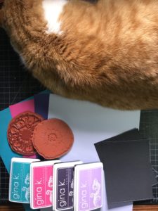
I am going to make 4 cards today– so I chose 4 inks from my collection and then paper that matches it. I am using Gina K Designs Inks and Papers. If you really like things matchy-matchy you should really check out her collection. The papers perfectly match all of her inks.
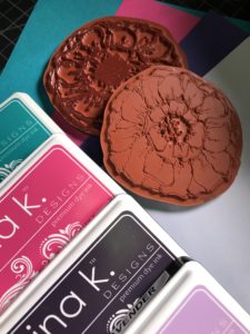
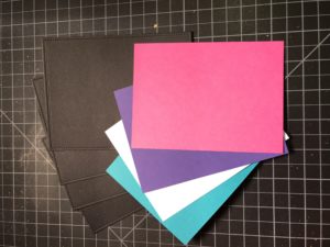
Next– I am using some plain black card stock which I die-cut using a rectangle stitched die and then I cut and scored some white card bases.

And of course… the most important part… THE STAMPS. Today I am using:
Alright… Step 1– Cutting all the layers:
For the panel for the stamped images I took some more white card stock and created die cuts with the next smallest rectangle die in my set to create 4 white stitched smaller rectangles.
Lastly– I wanted the stamped images to be matted on color coordinated card stock to really make the colors pop. So I just measured out and cut out with my paper cutter a rectangle that was slightly larger than my die cut white piece I will be using for the stamped images.
You can totally die cut this piece too– but I didn’t have the size that I wanted so the paper cutter worked perfectly for this step!
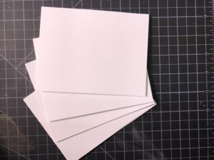
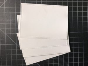
Now.. for the fun part! The stamping.
I sometimes hear a little bit of reluctance to try red rubber stamps because you cannot see through them like you can acrylic stamps. I am going to show you some tips and tricks on how you can become a pro at 2-step stamping with red rubber.
It really is a breeze– and so FUN.
I hardly ever stamp without my stamping best friend– the MISTI. It works really great when you are using a 2 step stamping technique like I am doing– or if you just really love to get a perfectly dark pigmented image.
Now I am taking my small stitched white rectangle cut outs and putting them into the MISTI.
Moment of honesty– I made a rookie mistake. Don’t just plop your paper in your MISTI– otherwise you don’t know where to put your other papers to make the stamp line up the same on each image.
You’ll see in a moment. Just learn from me– don’t do it! haha. Put it in the bottom right hand corner and magnet it down.
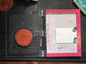
Okay so since I realized I made a mistake on my second panel– I just took a marker and marked on the side of the ruler where to line up my paper. Ooopsiess… anyone else have to learn things the hard way?
Okay so I simply laid the solid large floral on top of my white panel face down where I thought it would be nice and then just simply closed the lid to get the stamp to adhere to the inside of my MISTI.
Now it’s time to get inky– I started with my first color and stamped it down a few times until I got the desired pigmentation– like so:
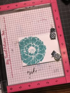
Isn’t it a beaut? Okay now for the easy part– Just clean off your stamp and put the next white stitched card base in there in the bottom right corner, magnet down, and repeat the stamping process for each color. Easy-peasy, right? You can do this as many times as you want and the stamp is already lined up in the exact position each and every time.
Now here’s the part where most people get a little nervous– lining up the outline with the solid image. I have a little trick for you 🙂
I cut a piece of acetate to use just for my MISTI. I placed the piece of acetate right over the top of the stamped image and used the magnet to hold it in place.
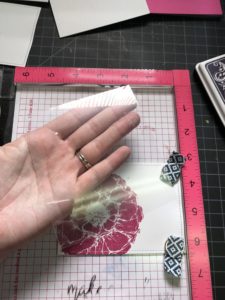
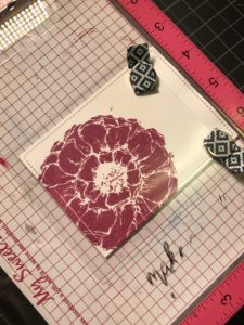
I next took the outline of the stamp and placed it face down over the top of the stamped image where I thought it would best line up. Once you have it all lined up how you think it SHOULD be.. take some dye ink (I like dye ink cause it’s easier to clean up for me) and ink up that outline and stamp down on top of your acetate.
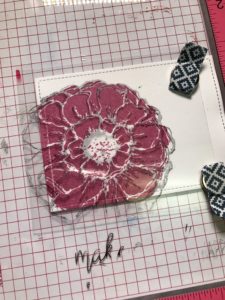
This is going to allow you to see what the outline would look like stamped on the colored image and let’s you adjust the stamp until you are happy with how they are lined up. Just clean off the acetate and stamp again until you’re happy.
I sort of like the outline to be a little off– These aren’t meant to be PERFECTLY outlined. So just keep that in mind before you drive yourself crazy 🙂
Once you’re happy remove the acetate and ink up that outline and repeat until you are happy with the darkness of the image. I wanted to have a pretty dark outline so I used a black Color Box pigment ink so I could emboss the outline.
Repeat the outline exactly how you did the colored images– just switching out rectangle bases that you already have the solid florals stamped on.
Now for the sentiments– I like to use somewhat general sentiments. Usually uplifting ones that could fit several different occasions. I really like the Kits Spark and Faith & Hope from Graciellie Designs. The sentiments are a mix of fonts and so encouraging!
I simply chose 4 different sentiments and stamped it right to the right hand side of my flower in that same Colorbox Ink in Black that I used for the outline.
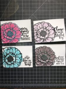
I wanted the sentiments to really pop– so I took some clear embossing powder and covered my entire stamped panel with it and then set it with a heat tool. It popped up the outline and the sentiment and made it look super glossy and pretty!
Now for the assembly! 😀
Take those colored rectangles that we cut earlier and adhere them to the stamped panels to create a lovely matted effect for each image.
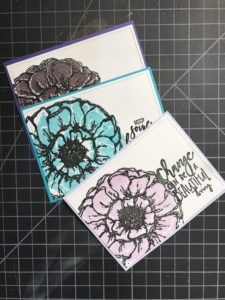
I then adhered the black die cut pieces to the front of the white card bases- like so:
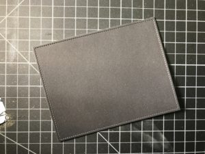
Then I took the matted stamped panels and adhered them right in the center of the card base on top of the black card stock.
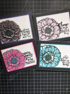
I love how the inks perfectly coordinated with the colored papers and really made it pop. I liked these cards.. but thought they needed a little something extra.
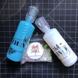
I thought that Nuvo Drops and some iridescent sequins would do the trick! I like iridescent because they pick up on the color that they around– kind of playing up that whole color coordinated theme again. And of course… RIBBONS.
I am quite obsessed with ribbons and just chose some that I had in my collection– I have a basic white one that I use on so many cards so of course I had to use that one for these– and then a pink and a blue one!
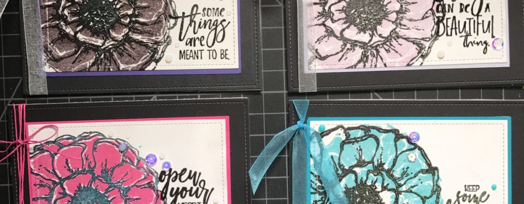
Here are the finished cards:
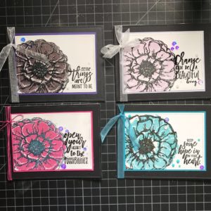
A little sparkle adds a whole lot, don’t ya think? Loving these cards! They were so much fun to make and totally inspired me to grab some of those inks and papers I don’t typically use to have some cards on hand.
Which color is your fav?
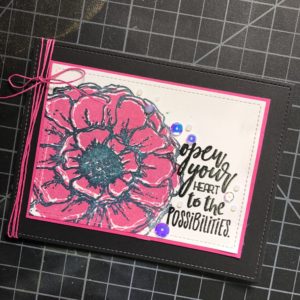
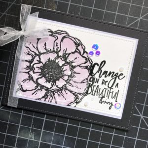
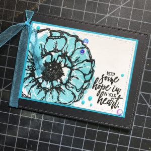
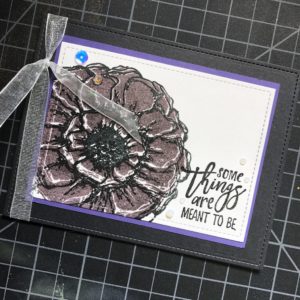
If you were inspired by this blog post– let me know! And share your creation on the Unity Show and Tell Facebook group. I’d love to see ya over there.
Have a happy Saturday, my lovely friends.
XOXO,
Whitney Magnuson
Supplies used:
Donna Peony (large floral image)
Lawn Fawn – Lawn Cuts – Dies – Outside In Stitched Rectangle Stackables
- Edible Eggplant
- Turquoise Sea
- Passionate Pink
- Lovely Lavender
Nuvo Drops
- Clear Morning Dew
- Caribbean Ocean
Neat & Tangled Sequins in the color- Like Magic
White Card stock (any will do!)
Black Card stock (any will do)


