Hi friends!
Today I’m tips for an easy coloring experience with beautiful and detailed designs such as this one! Introducing Wildflowers Stand Tall background stamp, part of the new release this week! I’m going to share a few helpful tips to make the coloring process easier for you!
Coloring can be intimidating, especially with a detailed design such as this one. But there are ways to simplify the process and actually make coloring enjoyable.
- Use paper that your alcohol markers will blend nicely with. Good paper makes the blending process a gazillion times easier! I tested a few brands of paper on my Copic markers, and found that Xpress It paper gave me the smoothest blend. So grab a couple brands of paper (when they’re on sale of course) and test your markers against them. Choose the paper where blending comes easilly for you. Each brand of alcohol marker works differently with paper, so the testing process is essential for easy and effective blending! It’s worth the effort, trust me!
- Limit your markers to 3 shades in a color family – dark, medium, and light. Play with the coloring blending on your paper until you find a combination that plays well together.
- Go back in with colored pencils to add detail and shading after you’ve finished coloring. Your colored pencils should be very sharp at all times, and you want to use a light touch. Start with the areas where there is shading and build out the color by making circular motions (very very lightly).
- Use white colored pencil to enhance highlights. Again, use a very light touch to add white so that you don’t drown out the color beneath it.
- For the entire design, limit your color famillies to no more than 3 or 4. If you have too much color going on, it can confuse the eyes as it searches for a place to settle. You want the eye to roam freely around the design you’ve colored. Coordinating your colors in advance will allow for a cohesive blend of colors.
- Keep your alcohol markers well lubricated and clean. Inky, clean markers work much better than ones that are dry. It will make the coloring process sooooo much easier for you!
Now that I’ve shared helpful tips for a successful coloring session, let’s color!
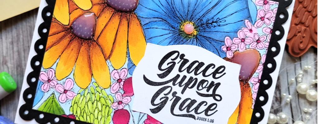
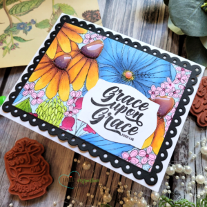
I stamped the Wildflowers Stand Tall image onto XPress It paper using permanent black ink. Permanent black ink won’t bleed with alcohol markers. Next, I chose my colors for the design and I grabbed my Copic markers to get ready for some fun coloring! The large blue flower was colored using N2 (for shading), B32 and B34. The sunflowers were colored in Y15, Y19, and YR16 and the stamin on the sunflower was colored in E35, E37 and E39. The remaining flowers were colored in shades of pink. I didn’t spend as much time on the little flowers – they were mainly just “fill-in color”.
When the coloring was finished, I filled int the white space with BG000 and then added shading and detail with my Prisma colored pencils in white, Indigo Blue and Dark Purple. I also added Glossy Accents over the stamin on the sunflowers for a bit of shine and dimension. This whole coloring process might have taken 1 1/2 hours!
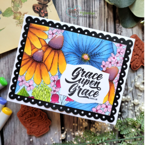
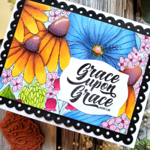
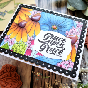
I finished the card by trimming down the panel and placing it over a black piece of cardstock die cut using a scalloped edge die. Both pieces were adhered to a white card base sized 5.5×4.25. The sentiment is from an older sentiment kit that can be found here.
I’m so glad you joined me today, and I hope that I have been helpful in sharing a few easy coloring tips for you! To shop the new release, click here.